Our visual style
We’ve established a visual style that is designed to grab attention.
Bold, clear, and direct, like our personality.
It’s reflected in our vibrant colour palette and punchy font. We use blocks and squares in our graphics – paying homage to our architectural heritage, reflected in our logo.
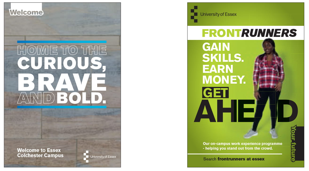
Our Essex spirit is all about authenticity and real-world grit; this is a place where change happens and we express this in our visual style. Using vibrant, bold, impactful real images of Essex buildings and our Essex people to reflect the authentic Essex stories.
And because they see us as a whole, not individual departments, our approach is consistent, unified and simple.
We are united in one voice.
We are always recognisable.
We are Essex.
Building blocks of our visual style
We’re bold, vibrant, and straight to the point, so we express this in our visual style as a key part of our identity.
Underlying block-like grid
Our visual style is based on a simple but flexible underlying block-like grid.
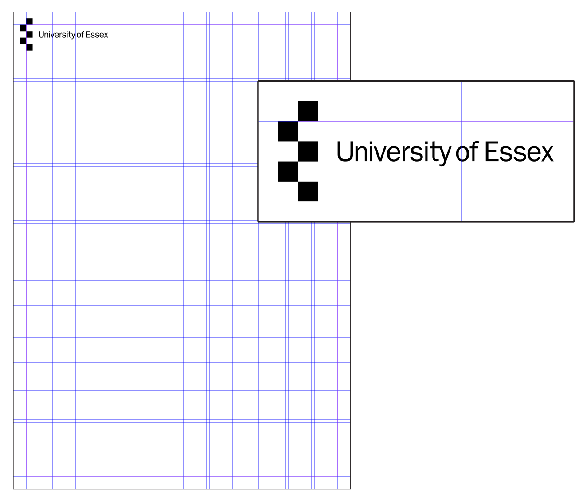
Our grid based system underpins all of our designs and is always the start-point of our creative design process.
- It acts as a guide for laying out text and images.
- Sometimes the grid is used to create a border.
- The grid can also be used on digital media.
- Designs can be set at a slight tilt but must be at no more than a five degree angle.

Please do not attempt to recreate grids.
Each grid system is based on the original size of our logo for each application. The table below outlines our most commonly used sizes.
| Application size | Logo size | Grid structure | Row / column gutters | Page margins |
| A3 (portrait) | 28mm (h) | 12 (w) x 16 (h) | 3mm | 11.2mm |
| A4 (portrait) | 20mm (h) | 12 (w) x 16 (h) | 2mm | 8mm |
| A5/DL (portrait) | 15mm (h) | 12 (w) x 16 (h) | 1.5mm | 6mm |
| 85x55mm (landscape) | 12mm (h) | 6 (w) x10 (h) | 1mm | 4.8mm |
Our University logo
Our logo requires size limits and safe areas to guard it from being poorly reproduced, unrecognisable, illegible, or obscured.
Take a look at our University logo page to find out;
- appropriate use of our logo
- how to request our approved logo files
- sending to third parties
- use in partnerships and co-branding
- special anniversary badges
Our bold colour palette
Our colour palette is bold and vibrant. Our palette of contrasting colours brings our personality to life.
Find out more on using our colour palette.
Our no-nonsense font
Archivo is our font.
As we always ensure our messaging gets straight to the point, it’s important our typeface reflects this no-nonsense approach.
Find out more about using our font.
Adding line spacing, bullets and numbering
Line spacing
Spacing is set quite tightly; as a guide, Archivo body copy is set 9pt type on 11pt.
Headings are set with a +1pt leading. This will vary depending on the ascenders and descenders, so care should be taken that they don’t hit each other or look too widely spaced. As a guide, some of the applications in these guidelines are 34pt type on 35pt leading or 50pt type on 51pt leading.
Bullet points
Bullet points are square. Square options can be set as standard in Microsoft packages. Where this is not available, they can be set using a lower case 'n' in Wingdings.
A guide has been developed to help create the correct bullet points: How to create bullet points in Word 2010 (.docx)
- They should be set at 80% of the text size.
- Align bullet points to body copy and no indentation. Sub-bullets should take the form of a dash and should be indented.
- As the font size increases so should the indentation space. For 12 pt font size, indention size (tab) is 4.5mm.
- Colour can be applied to bullet points to add visual interest.
- Text should be left justified on bullet points.
Numbering
Numbering should not be indented and in-line with the body copy.
Adding graphical elements
We use blocks and squares in our graphics – paying homage to our architectural heritage, reflected in our logo.
This means that Essex does not use curves, circles or rounded edges in any expression of our visual style. And to maintain our real-world and authentic approach, we don’t use icons, illustration, clipart, or AI generated elements.
Blocks, layers, brackets, and lines are examples of how you can apply graphics to your content.
Blocks
- Blocks are reflective of the squares in our logo, so they should be right angled and not rotated. They can be rectangular or square, depending on what best suits the design.
- They can be a solid block or outlined and in a solid colour or a gradient. [1]
- They can be used behind text as a solid block, or around text as an outline.
- Outlined blocks can also be open on one side, so text extends outside of the bounds of the block, and left-aligned. [2]
- Outline blocks can be used to interact with photography in a creative way to express our personality. [3]
- A solid block and outlined block can be combined to create a layered effect. The order of these elements can be switched to create different results. [4]
- An image can be contained in the solid block.

Brackets
Brackets are taken from our outlined block and logo squares.
- Brackets should only be used to frame headings and pull quotes.
- Text framed by brackets should be fully justified or left-aligned and positioned centrally within the brackets. [1]
- Two or four brackets can be used to frame the text. [2]
Lines
- Single lines can be used as horizontal dividers [3], or vertically to add emphasis to text. [4]
- Lines can be a solid colour or a gradient.
- Only horizontal and vertical lines should be used, please do not use them at an angle.
- Make sure you leave enough space between the text and the line so it doesn’t look like a hyperlink or underlined text. [3]
Audio indicator
An animated device can be used to show that a piece of video has audio to listen to, for example a post on LinkedIn to promote an episode of a Podcast. [3]
Icons
Our visual style is impactful because it focuses on being real and authentic, so please avoid using icons or illustrations.
![]()
Our photography style
Our photography helps tell the Essex story – to showcase our diverse global community, creative research and iconic buildings. Photography should express our personality and Essex spirit – bold and vibrant.
The following quick tips should help you select the right images:
- Where possible we only use Essex students, staff and buildings in our photography. [1]
- Stock photography should only be used where it would be inappropriate to use Essex students or staff, or where suitable images are unavailable.
- Choose photos that look natural and avoid using forced framing or staged shots of people. [2]
- Portraits where the subject is looking directly at the camera can feel unnatural so you can generally avoid these.
- Where there is more than one person in the shot, make sure they are interacting with each other. [3]
- Be thoughtful about whether any props in your shot reflect the collective positive efforts of the University. For example avoid showing people using single-use plastic bottles or coffee cups. [4]

More information on our image library and how to choose images can be found on our photography style page.
Motion principles for digital graphics and video
Our visual style also applies to motion. Videos should look like Essex through their graphic styling, but should also feel like Essex in the way they move.
We are bold, straightforward and create impact, so any movement needs to reflect this.
When adding motion, we have some simple principles to follow for keeping things consistent:
Angular
Should move in one of four directions: up, down, left and right, which is reflective of the Essex logo. They shouldn’t move along diagonals. Scaling up and down can also be used, but objects should not be rotated.
Energetic
To reflect the exciting and bold nature of Essex, pacing and timing should be lively and full of energy. Use quick cuts and transitions to create impact and keep content dynamic. Text should appear in an instant, rather than fade in and out.
Simple
Motion should enhance the content rather than distract from it so keep motion simple and to the point. (Overusing motion effects can make content appear too flashy or gimmicky, which can reduce engagement.)
Headings or titles
Image movement
Blocks
Brackets
Longer text
Transitions
Supertags
The aim of a supertag is to help students recognise the key theme of the communication they are receiving.
Students need to know the general theme of a communication – not what team or section created it. Supertags are not to be used like individual logos.
With our supertags, the goal is for different teams communicating about a similar theme all to use the same supertag. By providing consistency, we can cut down on confusion and help our students identify key communication.
- Supertags should only be used on internal student communications.
- They are organised by service or department.
- Supertags must always be used in conjunction with the Essex logo. The Essex logo must be positioned in the top left or bottom right corner.
- For printed communications such as posters and leaflets, supertags will be positioned either in the top left hand corner or vertically in bottom right hand edge.
All requests for new supertags must be approved by the Internal Communications team. Please email comms@essex.ac.uk with your request in the first instance.
Take a look at our range student-facing posters with supertags for academic departments and professional services.
Consistency through simplicity
By giving all our content and communications a consistent style and tone with the core University identity we:
- Raise our profile, reputation, and presence.
- Build clear differentiation in a sea of universities.
- Ensure we’re recognised for everything we do and offer.
The simplicity of our ‘one University’ approach provides a consistent perception and we become clearly identifiable. Greater recognition boosts our profile and expands our reach to more students, more investors, more partnership opportunities.
Consistency of style is about trust. A lack of consistency undermines trust. So having a consistent identity is really quite important.
Every time the visual elements of the brand are used is an opportunity to tell part of the Essex story, to whichever stakeholder you are targeting.
Someone who’s an undergraduate one year, may be a postgraduate in a few years time, may even go on to be a parent. We have businesses, research partners, all sorts of people accessing the University through different touchpoints: social, web, email, posters, digital screens, video, adverts etc. And we want to give a consistent style over a lifetime of connections with the University.
To create a seamless experience, it’s important that all our content reflects our visual style, with a consistent look and feel when clicking through to our social platforms or our website, or when they see other communications from Essex.