Top of the [Tableau] Crops
Last year was a year we will never forget. It was also a year when we relied on digital information like never before and everyone was under increased pressure to accurately report, predict and monitor patterns of student and staff behaviour. That hunger for data meant that a record number of clicks were directed at Tableau dashboards, 125k to be precise, and the most sought after dashboard was clicked onto a massive 20k times.
For those of you who don’t live and breathe ‘Big Data’ - Tableau is a data visualisation and analytics tool which aims to help people see and understand data. In other words, it simply converts raw data into an easily understandable format. This comes in handy when you have 15,000+ students and 2,000+ staff to keep an eye on.
In this blog, we will provide a rundown of the top 3 dashboards you just couldn’t get enough of in 2020 by section.
Third Place
Actual vs. targets

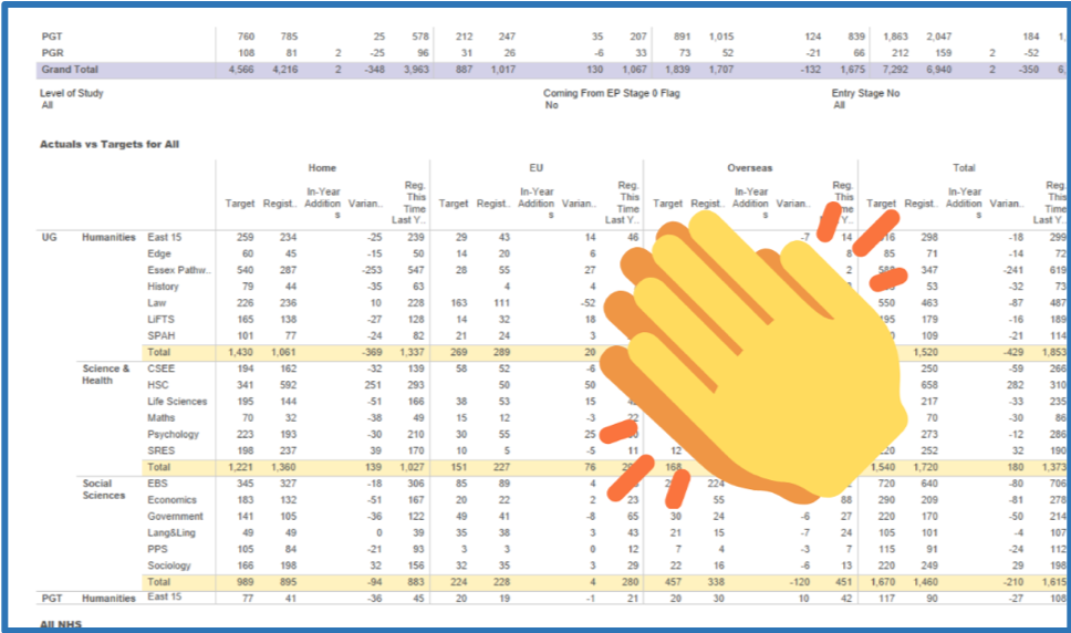
In at third place, it is the PDI Actuals VS Targets report. No one need doubt your engagement with reaching Minimum Student Entry Targets: 1.6k clicks by 215 of you shows us precisely how keen you were to track recruitment. Who can blame you this year with Brexit, a pandemic and lifted student number caps threatening to change fortunes?
Second Place
The second most popular dashboard was students’ coursework marks. This report provides staff with a report of individual student coursework marks. This has been an exciting and much needed development on Tableau over the last few years - last year this report was viewed 5,134 times and by 235 of you. It helpfully allows tutors to track students’ progress and make interventions as and when needed.
If you would like access to this almost-winning dashboard email the progress team.
First place
Undergraduate Admissions Tableau Dashboard

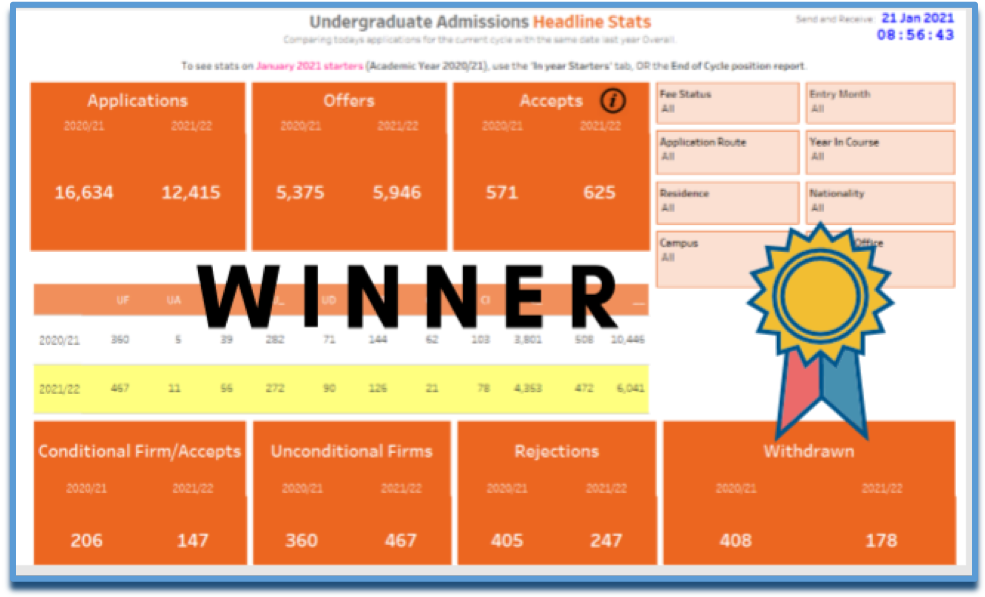
This year’s clear winner was the CER UG Admissions dashboard. Now we can’t definitely refute that the 20k clicks can be attributed solely the Director of Admissions (!) - but we are instead betting that this 20k was the collective effort of the university during clearing and achieving the 7,000 student numbers we did this year. To put the dependency on this dashboard into context it was used 390% more than the second placed dashboard on this list.
There we have it our top three Tableau dashboards of 2020. It is no surprise that student numbers and student progression heavily feature – a positive sign that staff are working flat out to ensure the admissions process runs smoothly and once students are here we want to make sure they do their best.
Planning and Data Insight offer free Tableau training throughout the year so that you can learn about what we have to offer for you dashboard-wise at Essex: you can sign up here.
Of course, if you have any suggestions for improvements or new dashboards please get in touch at: poquery@essex.ac.uk.
