Using our font
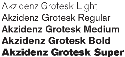
Akzidenz Grotesk is our font. As we always ensure our messaging gets straight to the point, it’s important our typeface reflects this no-nonsense approach. There are 10 different variants to choose from (5 weights, each with an italic).
You should use Akzidenz for everything from headlines to paragraph text.
- Different weight fonts provide tonal stretch, from big and bold to elegant and refined.
- Akzidenz Grotesk Super should only be used for headings, bold statements and titles on content.
- Akzidenz Super is not suitable for paragraph text.
- Akidenz Grotesk Light or Regular should be used for sub-headings and straplines on videos.
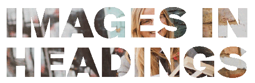
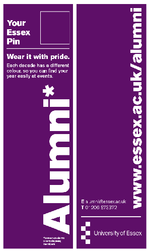
- Akzidenz Super can be used as an outline to give a lighter impression, cut-out with an image showing through, or with a gradient of two colours.
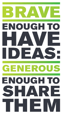
- For a distinctively Essex look and feel, we have developed a particularly stylised approach to our text. This means we enlarge certain words to help create a fully justified blocky visual.
Layout of our font
We favour bold typography, so large font sizes and the heavier weight of fonts. This should be taken into account when choosing a background image.
- Generally we favour left aligned text, though right aligned is also acceptable.
- Short punchy statements can be fully justified (meets right and left margins) using different sized fonts and stacked so that it dominates the frame.
- ALL CAPITALS should be limited to short headlines only of two or three words (for accessibility).
- Where possible, avoid using ALL CAPITALS and italics in any body of text.
- Do not underline text in titles, underline signifies link text.
- Word clouds are not to be used, as they look dated and don’t fit within the distinctive Essex style.
- Type can be used in any colour from the palette, as long as there is enough contrast to make it accessible. Read: meeting accessibility requirements.
- Combine different weights or mix lower and uppercase to achieve different effects.
- There is flexibility for vertically arranged type.
- Type can be used in any colour from the palette, as long as there is enough contrast to make it accessible.
Example of adequate contrast:

Example of not enough contrast:

Our default font
Our default font Akzidenz is for use in our marketing materials. For Microsoft packages – namely Excel, Outlook, PowerPoint and Word – and instances where a font licence does not exist you can substitute with our chosen default fonts.
- Arial Black can be used for headings in place of Akzidenz Super.
- Arial is our chosen default font for body copy (paragraph text).
Word will open with Calibri as the default font. The instructions below will set Arial as the default font in all new word documents, in line with our Essex identity: Changing your Word template (.docx).
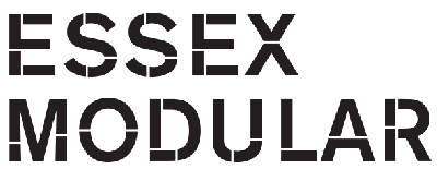
Essex Modular is a bespoke font used on our signage only.